Introduction XAML
XAML stands for Extensible Markup Language. XAML is the preferred way for creating the UI in Xamarin Forms apps. XAML is also used in creating Windows UWP applications.
The version for Windows UWP is not the same as the one used for Xamarin.Forms applications but there's effort to standardize the different XAML versions.
Design Interface
Unlike Android Studio and XCode that comes with a visual design tool, there's no drag and drop tool in Visual Studio for creating the UI with XAML.
We will largely depend with intelli-sense for auto-completing the XAML. In some instances the intelli-sense will stop working and you might be forced to restart Visual Studio.
File Structure
XAML files are composed of two files. The UI and the code behind. If we were to create an example Login page we would have the following :
Login.xaml- XAML UILogin.xaml.cs- Code behind for the UI
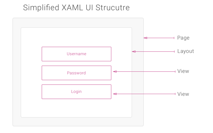
XAML UI Structure
A XAML view is composed of a Page. Within the Page different Layouts can be used and within the Layout several views are used to created the UI.
Here is a simplified structure of a single XAML view.
Code vs XAML
Instead of using XAML, we can also create the UI entirely in code.
Note
Creating UIs in code is not recommended and does not promote code sharing. When creating most apps, designers need to beautify the app, and not many designers can code. Designers can easily work in XAML without having to touch the underlying code for the app.
Login.xaml
<?xml version="1.0" encoding="UTF-8"?>
<ContentPage xmlns="http://xamarin.com/schemas/2014/forms"
             xmlns:x="http://schemas.microsoft.com/winfx/2009/xaml"
             x:Class="TextSample.XAML.LoginPage">
    <ContentPage.Content>
    </ContentPage.Content>
</ContentPage>
Login.xaml.cs
using System;
using System.Collections.Generic;

using Xamarin.Forms;

namespace TextSample.XAML
{
    public partial class LoginPage : ContentPage
    {
        public LoginPage()
        {
            InitializeComponent();
        }
    }
}
Page
XAML pages derive from the Page class. The most commong type of the page is the ContentPage. A page usually takes the whole screen or part of the screen. The default project template creates a simple ContentPage.
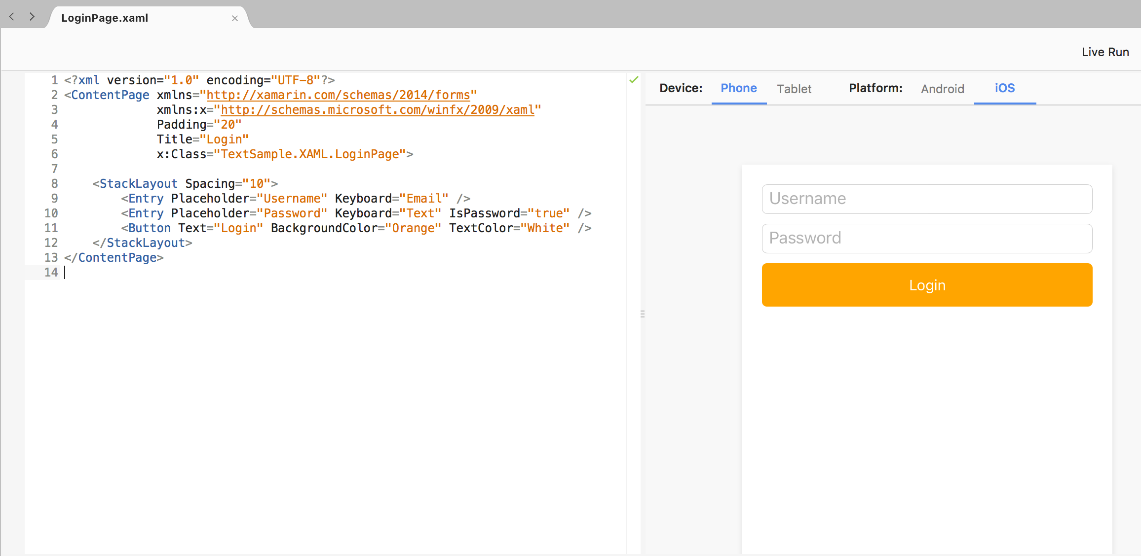
The contents of a ContentPage are assigned in the Content property. The Content property can only take one child. In XAML, Content property is the default, so we do not need to specify it, we can just start populating the content as follows :
<?xml version="1.0" encoding="UTF-8"?>
<ContentPage xmlns="http://xamarin.com/schemas/2014/forms"
             xmlns:x="http://schemas.microsoft.com/winfx/2009/xaml"
             Padding="20"
             Title="Login"
             x:Class="TextSample.XAML.LoginPage">

    <StackLayout Spacing="10">
        <Entry Placeholder="Username" Keyboard="Email" />
        <Entry Placeholder="Password" Keyboard="Text" IsPassword="true" />
        <Button Text="Login" BackgroundColor="Orange" TextColor="White" />
    </StackLayout>
</ContentPage>
Note
With the XAML previewer we can see the preview as we build the page.
Page Types
Out of the box, Xamarin Forms have the following Pages available :
- ContentPage
- MasterDetailPage
- NavigationPage
- TabbedPage
- TemplatePage
- CarouselPage
We will discuss these pages in more detail
Referencing XAML Controls in Code
To have access to the XAML controls in code, we can use the predefined XAML namespace xmlns:x="http://schemas.microsoft.com/winfx/2009/xaml. This is already defined for you when you create a new XAML page. We can use x:Name extension to give variable names to controls, and those variable names will be automatically be available in the code behind file.
<Button Text="Login" BackgroundColor="Orange" TextColor="White" x:Name="btnLogin" />
In the code behind file, we will now have a variable called btnLogin. We can now manipulate the variable however we want.
Adding Events to Controls
We can also attach events directly to controls in XAML. E.g to have the attach the TextChanged event to the username filed defined above :
In XAML
<Entry Placeholder="Username" Keyboard="Email" TextChanged="UsernameChanged" />
In Code
void UsernameChanged(object sender, Xamarin.Forms.TextChangedEventArgs e)
{
    throw new NotImplementedException();
}
Complex Properties
Most of the properties set on the views are complex objects, e.g the Margin is of type Thickness. There are two ways to set the value :
- Using ValueConverter
- Using Attached Properties
Value Converter
Using a value converter, we can easily set a complex property. E.g, to set the padding to 20 for the content page, we can do the following :
<ContentPage xmlns="http://xamarin.com/schemas/2014/forms"
             xmlns:x="http://schemas.microsoft.com/winfx/2009/xaml"
             xmlns:local="clr-namespace:Intro" x:Class="Intro.MainPage"
             Padding="20">
We are setting Padding="20" as a sting value, a ValueConveter is used to convert the string value to its corresponding Thickness type.
Attached Properties
We can also have properties not defined on that control be made available by attaching them. Properties can be attached when the control is embedded inside the outer control that have the property available. E.g, the Grid layout, defines Grid.Row and Grid.Column. We can have these controls available to child controls of the grid e.g
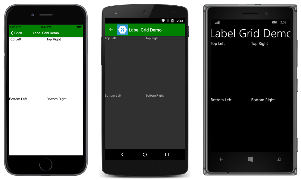
<Grid>
  <Grid.RowDefinitions>
    <RowDefinition Height="*" />
    <RowDefinition Height="*" />
  </Grid.RowDefinitions>
  <Grid.ColumnDefinitions>
    <ColumnDefinition Width="*" />
    <ColumnDefinition Width="*" />
  </Grid.ColumnDefinitions>
  <Label Text="Top Left" Grid.Row="0" Grid.Column="0" />
  <Label Text="Top Right" Grid.Row="0" Grid.Column="1" />
  <Label Text="Bottom Left" Grid.Row="1" Grid.Column="0" />
  <Label Text="Bottom Right" Grid.Row="1" Grid.Column="1" />
</Grid>
The Label control does not have a property of type Grid.Row. Since the Label is a child of the Grid, we can attach the property to the Label.