Android Layouts
Overview
View Layouts are a type of View class whose primary purpose is to organize and position other view controls. These layout classes (LinearLayout, RelativeLayout, etc.) are used to display child controls, such as text controls or buttons on the screen.
Android activities (screens) use layouts as a container for view controls, and layouts can actually contain other nested layouts as well. Nearly all Android activities have layout containers similar to the way that most HTML documents use "divs" to contain other content.
There are a few very commonly used layouts and then many more specialized layouts that are used in only very particular cases. The bread and butter layouts are LinearLayout, RelativeLayout, and FrameLayout.
It's important to note the class hierarchy of these View Layouts. Each of them subclass ViewGroup, which itself subclasses View. That means it is perfectly legal to pass a layout such as LinearLayout as an argument for something that takes View as a parameter. ViewGroup also contains the nested static class LayoutParams which is used for creating or editing layouts in code. Keep in mind that each subclass of ViewGroup, such as LinearLayout, has its own nested static class LayoutParams that's a subclass of ViewGroup.LayoutParams. When creating View Layouts in code, beginners will often confuse the many different available LayoutParams classes and run into hard to catch problems.
LinearLayout
In a linear layout, like the name suggests, all the elements are displayed in a single direction either horizontally or vertically and this behavior is specified in android:orientation which is an attribute of the node LinearLayout.
All children of a LinearLayout are displayed sequentially based on the order they are defined within the layout. A LinearLayout respects margins between children and the gravity (right, center, or left alignment) of each child.
Common view attributes you might see used in a LinearLayout:
android:gravity- Controls the alignment of the view content (akin to text-align in CSS)android:layout_gravity- Controls the alignment of the view within it's parent container (akin to float in CSS)android:layout_weight- Specifies how much of the extra space in the layout to be allocated to a view.
Example of LinearLayout snippet:
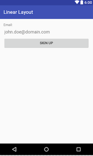
1 2 3 4 5 6 7 8 9 10 11 12 13 14 15 16 17 18 19 20 21 22 23 24 25 | <?xml version="1.0" encoding="utf-8"?> <!-- Parent linear layout with vertical orientation --> <LinearLayout xmlns:android="http://schemas.android.com/apk/res/android" android:padding="16dp" android:orientation="vertical" android:layout_width="match_parent" android:layout_height="match_parent"> <TextView android:layout_width="match_parent" android:layout_height="wrap_content" android:text="Email:"/> <EditText android:hint="[email protected]" android:layout_width="match_parent" android:layout_height="wrap_content" android:id="@+id/editText" /> <Button android:text="Sign Up" android:layout_width="match_parent" android:layout_height="wrap_content" /> </LinearLayout> |
Will produce something like the image below. Note that the android:orientation is set to vertical.
Linear Layout Horizontal orientation
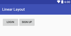
We will group two buttons side by side using a linear layout in horizontal orientation.
1 2 3 4 5 6 7 8 9 10 11 12 13 14 15 16 17 18 | <?xml version="1.0" encoding="utf-8"?> <!-- Parent linear layout with vertical orientation --> <LinearLayout xmlns:android="http://schemas.android.com/apk/res/android" android:padding="16dp" android:orientation="horizontal" android:layout_width="match_parent" android:layout_height="match_parent"> <Button android:text="Login" android:layout_width="wrap_content" android:layout_height="wrap_content" /> <Button android:text="Sign Up" android:layout_width="wrap_content" android:layout_height="wrap_content" /> </LinearLayout> |
And will produce something like the image below :
Distribute Widths with Layout Weight
To distribute the width in a linear layout we use the android:layout_weight property. We can also distribute the height using the same property. Lets make the buttons take equally the same space. Notice that the android:layout_width needs to be match_parent for both buttons and theandroid:layout_weight will be used to proportionally divide the space.
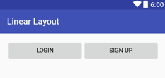
And we can make the Login button take all the remaining space by just giving it the android:layout_weight=1 and wrap_content on the Sign Up button as per the picture below.
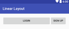
If you want to setup a part of your layout, such that, for instance, 3 buttons appear in a row, occupying equal space (or if, for instance, you want to give 4/5 space to a map and 1/5 to another component below it), LinearLayout can be used to do the trick by leveraging android:layout_weight.This works by setting the android:weightSum to a total value and then setting the android:layout_weight value for each subview to determine width distribution.
1 2 3 4 5 6 7 8 9 10 11 12 13 14 15 16 17 18 19 20 21 22 23 24 25 26 27 28 29 | <?xml version="1.0" encoding="utf-8"?> <!-- Parent linear layout with vertical orientation --> <LinearLayout xmlns:android="http://schemas.android.com/apk/res/android" android:padding="16dp" android:orientation="horizontal" android:layout_width="match_parent" android:layout_height="match_parent"> <LinearLayout android:layout_width="match_parent" android:layout_height="wrap_content" android:orientation="horizontal" android:weightSum="5" android:layout_alignParentBottom="true"> <Button android:text="Login" android:layout_width="0dp" android:layout_weight="2" android:layout_height="wrap_content" android:layout_alignParentLeft="true" /> <Button android:text="Sign Up" android:layout_width="0dp" android:layout_weight="3" android:layout_height="wrap_content" android:layout_alignParentRight="true" /> </LinearLayout> </LinearLayout> |
{{< note title="Layout Performance" >}} For performance, when using android:layout_weight, you should set the android:layout_width=0dp so that Android does not have to calculate the width as well since its already being calculated using android:layout_weight. {{< /note >}}
Using the above XML, Login will have 2/5 of total container width and Sign Up will have 3/5 of parent width because we set the total android:weightSum to 5 and the buttons android:layout_weight property to 2 and 3 respectively.
Use caution in utilizing multiple nested LinearLayouts and/or layout_weight from a performance standpoint!
Gravity
The android:layout_gravity is used to position the view within its parent. We can place the view to the left, right, start, bottom, center and so on.
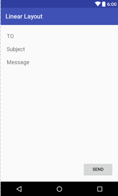
1 2 3 4 5 6 7 8 9 10 11 12 13 14 15 16 17 18 19 20 21 22 23 24 25 26 27 28 29 | <?xml version="1.0" encoding="utf-8"?> <!-- Parent linear layout with vertical orientation --> <LinearLayout xmlns:android="http://schemas.android.com/apk/res/android" android:padding="16dp" android:orientation="vertical" android:layout_width="match_parent" android:layout_height="match_parent"> <EditText android:layout_width="match_parent" android:layout_height="wrap_content" android:hint="TO" /> <EditText android:layout_width="match_parent" android:layout_height="wrap_content" android:hint="Subject" /> <EditText android:layout_width="match_parent" android:layout_height="0dp" android:layout_weight="1" android:gravity="top" android:hint="Message" /> <Button android:layout_width="100dp" android:layout_height="wrap_content" android:layout_gravity="right" android:text="Send" /> </LinearLayout> |
In the image below the android:layout_gravity property is used to place the Send button to the right :
Nesting Layouts
We can nest a LinearLayout inside another LinearLayout. For performance you should limit the nesting to only 2 levels. Excessive nesting reduces drawing performance.
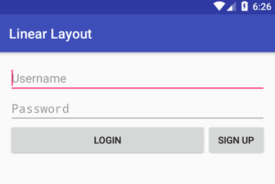
1 2 3 4 5 6 7 8 9 10 11 12 13 14 15 16 17 18 19 20 21 22 23 24 25 26 27 28 29 30 31 32 33 34 | <?xml version="1.0" encoding="utf-8"?> <!-- Parent linear layout with vertical orientation --> <LinearLayout xmlns:android="http://schemas.android.com/apk/res/android" android:padding="16dp" android:orientation="vertical" android:layout_width="match_parent" android:layout_height="match_parent"> <EditText android:hint="Username" android:layout_width="match_parent" android:layout_height="wrap_content" /> <EditText android:hint="Password" android:inputType="textPassword" android:layout_width="match_parent" android:layout_height="wrap_content" /> <LinearLayout android:orientation="horizontal" android:layout_width="match_parent" android:layout_height="wrap_content"> <Button android:layout_weight="1" android:text="Login" android:layout_width="match_parent" android:layout_height="wrap_content" /> <Button android:text="Sign Up" android:layout_width="wrap_content" android:layout_height="wrap_content" /> </LinearLayout> </LinearLayout> |
Will look like the image below :
RelativeLayout
In a relative layout every element arranges itself relative to other elements or a parent element. RelativeLayout positions views based on a number of directional attributes:
- Position based on siblings: layout_above, layout_below, layout_toLeftOf, layout_toRightOf
- Position based on parent: android:layout_centerHorizontal, android:layout_centerVertical
- Alignment based on siblings: layout_alignTop, layout_alignBottom, layout_alignLeft, layout_alignRight, layout_alignBaseline
- Alignment based on parent: layout_alignParentTop, layout_alignParentBottom, layout_alignParentLeft, layout_alignParentRight
An example of a RelativeLayout:
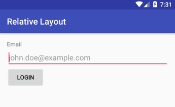
1 2 3 4 5 6 7 8 9 10 11 12 13 14 15 16 17 18 19 20 21 22 23 24 25 26 27 28 29 30 31 | <?xml version="1.0" encoding="utf-8"?> <!-- Parent linear layout with vertical orientation --> <RelativeLayout xmlns:android="http://schemas.android.com/apk/res/android" android:padding="16dp" android:layout_width="match_parent" android:layout_height="match_parent"> <TextView android:id="@+id/label" android:layout_width="match_parent" android:layout_height="wrap_content" android:text="Email" /> <EditText android:hint="[email protected]" android:id="@+id/inputEmail" android:layout_width="match_parent" android:layout_height="wrap_content" android:layout_below="@id/label" /> <Button android:id="@+id/btnLogin" android:layout_width="wrap_content" android:layout_height="wrap_content" android:layout_below="@id/inputEmail" android:layout_alignParentLeft="true" android:layout_marginRight="5dp" android:text="Login" /> </RelativeLayout> |
Will have produce a layout as below :
and another example of a Realtive Layout :
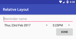
1 2 3 4 5 6 7 8 9 10 11 12 13 14 15 16 17 18 19 20 21 22 23 24 25 26 27 28 29 30 31 32 33 | <?xml version="1.0" encoding="utf-8"?> <RelativeLayout xmlns:android="http://schemas.android.com/apk/res/android" android:layout_width="match_parent" android:layout_height="match_parent" android:paddingLeft="16dp" android:paddingRight="16dp" > <EditText android:id="@+id/name" android:layout_width="match_parent" android:layout_height="wrap_content" android:hint="Reminder name" /> <Spinner android:entries="@array/dates" android:id="@+id/dates" android:layout_width="0dp" android:layout_height="wrap_content" android:layout_below="@id/name" android:layout_alignParentLeft="true" android:layout_toLeftOf="@+id/times" /> <Spinner android:entries="@array/times" android:id="@id/times" android:layout_width="wrap_content" android:layout_height="wrap_content" android:layout_below="@id/name" android:layout_alignParentRight="true" /> <Button android:layout_width="96dp" android:layout_height="wrap_content" android:layout_below="@id/times" android:layout_alignParentRight="true" android:text="Done" /> </RelativeLayout> |
Note the spinner entries are defined in the arrays.xml file as follows :
1 2 3 4 5 6 7 8 9 | <?xml version="1.0" encoding="utf-8"?> <resources> <string-array name="dates"> <item>Thur, 23rd Feb 2017</item> </string-array> <string-array name="times"> <item>3:25PM</item> </string-array> </resources> |
and will produce the image as below :
Read this RelativeLayout tutorial for a more detailed overview. You can also see more about this layout by inspecting the RelativeLayout.LayoutParams docs and the official RelativeLayout guide.
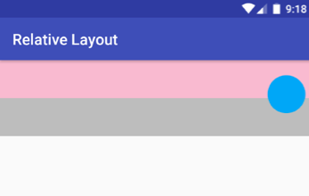
We can accomplish complicated layouts with the relative layout. In the following, we have put the circle on top of the other views, and also used negative margins to accomplish it.
1 2 3 4 5 6 7 8 9 10 11 12 13 14 15 16 17 18 19 20 21 22 23 24 25 26 | <?xml version="1.0" encoding="utf-8"?> <RelativeLayout xmlns:android="http://schemas.android.com/apk/res/android" android:layout_width="match_parent" android:layout_height="match_parent"> <View android:id="@+id/box1" android:background="#6b0c0c" android:layout_width="match_parent" android:layout_height="50dp"/> <View android:layout_below="@+id/box1" android:id="@+id/box2" android:background="#18aaed" android:layout_width="match_parent" android:layout_height="50dp"/> <View android:layout_marginRight="10dp" android:layout_alignParentRight="true" android:layout_marginBottom="-20dp" android:layout_above="@+id/box2" android:id="@+id/box3" android:background="@drawable/bg" android:layout_width="50dp" android:layout_height="50dp"/> </RelativeLayout> |
The background is a drawable resource, its created in the drawable folder. We will cover drawables in the styleing section.
bg.xml
1 2 3 4 5 | <?xml version="1.0" encoding="utf-8"?> <shape xmlns:android="http://schemas.android.com/apk/res/android" android:shape="rectangle"> <solid android:color="#bf14ae"/> <corners android:radius="25sp" /> </shape> |
Will produce the output as in the following picture :
Using Alignment to Control Width or Height
A less understood aspect of RelativeLayout is how the use of alignment can determine width or height. It may seem counterintuitive at first about how this works, so we'll walkthrough a few examples in this section. Using this approach is especially useful in matching the widths or heights relative to other elements.
Example 1: How alignment can determine width
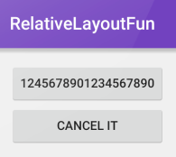
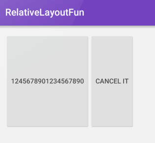
Suppose we have two buttons of varying widths:
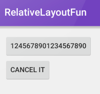
The corresponding XML would be:
1 2 3 4 5 6 7 8 9 10 11 12 13 14 15 16 17 18 19 20 21 | <RelativeLayout xmlns:android="http://schemas.android.com/apk/res/android" xmlns:tools="http://schemas.android.com/tools" android:layout_width="match_parent" android:layout_height="match_parent" android:paddingLeft="@dimen/activity_horizontal_margin" android:paddingRight="@dimen/activity_horizontal_margin" android:paddingTop="@dimen/activity_vertical_margin" android:paddingBottom="@dimen/activity_vertical_margin" tools:context=".MainActivity"> <Button android:layout_width="wrap_content" android:layout_height="wrap_content" android:text="1245678901234567890" android:id="@+id/button1"/> <Button android:layout_width="wrap_content" android:layout_height="wrap_content" android:text="CANCEL IT" android:id="@+id/button2" android:layout_below="@id/button1" android:layout_alignLeft="@id/button1" /> </RelativeLayout> |
Suppose we also specify that the second button should be aligned left and right to the first button. If we add android:layout_alignRight="@id/button1" to the second button's XML style, the change causes the second button to expand the width to match that of the first button. In other words, the only way to meet the requirements of specifying alignment on both sides is to expand the width of the second button.
In this way, when two elements are vertically positioned above or below the other, left and right alignments will control the width. When two elements are positioned horizontally next to each other, top and bottom alignments will control the height. We'll show how height can be impacted by specifying top and bottom alignments in the next example.
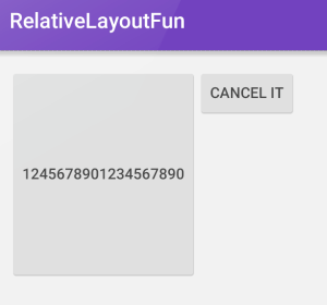
Example 2: How alignment can determine height
Suppose we have this layout definition:
1 2 3 4 5 6 7 8 9 10 11 12 13 14 15 16 17 18 19 20 21 | <RelativeLayout xmlns:android="http://schemas.android.com/apk/res/android" xmlns:tools="http://schemas.android.com/tools" android:layout_width="match_parent" android:layout_height="match_parent" android:paddingLeft="@dimen/activity_horizontal_margin" android:paddingRight="@dimen/activity_horizontal_margin" android:paddingTop="@dimen/activity_vertical_margin" android:paddingBottom="@dimen/activity_vertical_margin" tools:context=".MainActivity"> <Button android:layout_width="wrap_content" android:layout_height="wrap_content" android:height="200dp" android:text="1245678901234567890" android:id="@+id/button1"/> <Button android:layout_width="wrap_content" android:layout_height="wrap_content" android:text="CANCEL IT" android:id="@+id/button2" android:layout_toRightOf="@id/button1" /> </RelativeLayout> |
The corresponding preview looks like:
If we wish to match the height of the first button, we can specify layout_alignTop and layout_alignBottom on the second button.
1 2 3 4 5 6 7 8 | <Button android:layout_width="wrap_content" android:layout_height="wrap_content" android:layout_alignTop="@id/button1" android:layout_alignBottom="@id/button1" android:text="CANCEL IT" android:id="@+id/button2" android:layout_toRightOf="@id/button1" /> |
The only way to fulfill this requirement is to expand the height of the second button as shown below:
PercentRelativeLayout
PercentRelativeLayout, a recent addition to the Design Support Library, enables the ability to specify not only elements relative to each other but also the total percentage of available space. In the past, in order to position two elements next to each other with equal height, you would normally have to create a LinearLayout within a RelativeLayout. PercentRelativeLayout helps solves this issue.
The percent relative layout is available from Nuget.
The layout_width and layout_height of the PercentRelativeLayout should determine the total width and height that can be used. Any elements contained within it should specify the width and height possible using layout_heightPercent and/or layout_widthPercent. Because this library is not part of the standard Android library, note that a custom attribute app namespace being used.
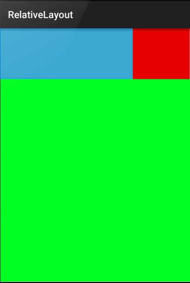
An example of a layout used to describe the image above is shown below (taken from this sample code):
1 2 3 4 5 6 7 8 9 10 11 12 13 14 15 16 17 18 19 20 21 22 23 24 25 26 27 28 29 30 31 32 33 | <android.support.percent.PercentRelativeLayout xmlns:android="http://schemas.android.com/apk/res/android" xmlns:app="http://schemas.android.com/apk/res-auto" android:layout_width="match_parent" android:layout_height="match_parent"> <View android:id="@+id/top_left" android:layout_width="0dp" android:layout_height="0dp" android:layout_alignParentTop="true" android:background="#ff44aacc" app:layout_heightPercent="20%" app:layout_widthPercent="70%" /> <View android:id="@+id/top_right" android:layout_width="0dp" android:layout_height="0dp" android:layout_alignParentTop="true" android:layout_toRightOf="@+id/top_left" android:background="#ffe40000" app:layout_heightPercent="20%" app:layout_widthPercent="30%" /> <View android:id="@+id/bottom" android:layout_width="match_parent" android:layout_height="0dp" android:layout_below="@+id/top_left" android:background="#ff00ff22" app:layout_heightPercent="80%" /> </android.support.percent.PercentRelativeLayout> |
Further samples include:
- https://github.com/JulienGenoud/android-percent-support-lib-sample
- https://github.com/lusfold/Android-Percent-Layout-Sample
- https://gist.github.com/vijaymakwana/e7fe04aaaa1cbaff8c6c98af1031e26a
- http://android-er.blogspot.com/2015/08/try-percentrelativelayout-and.html
Margin Percentages
The margins can also be set to a percentage of the total widths as well:
app:layout_marginStartPercentapp:layout_marginEndPercentapp:layout_marginTopPercentapp:layout_marginBottomPercent
We can also define app:layout_marginPercent that will be to all four values above.
Aspect Ratio
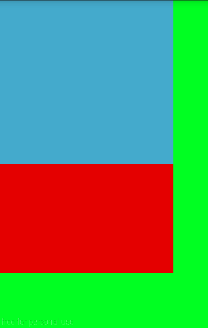
Similar to how [[ImageView|Working-with-the-ImageView#sizing-imageview-controls|]]'s adjustViewBounds:true can be used to scale the image according to its aspect ratio, we can also use PercentRelativeLayout to define an aspect ratio for a layout. If one dimension is set to 0dp and no percent scaling is associated with it, setting a percentage on the app:layout_aspectRatio attribute can scale the other to meet the ratio:
1 2 3 4 5 6 7 8 9 10 11 12 13 14 15 16 17 18 19 20 21 22 23 24 | <android.support.percent.PercentRelativeLayout xmlns:android="http://schemas.android.com/apk/res/android" xmlns:app="http://schemas.android.com/apk/res-auto" android:background="#ff00ff22" android:layout_width="match_parent" android:layout_height="match_parent"> <!-- not using aspectRatio here --> <View android:id="@+id/view1" android:background="#ff44aacc" android:layout_width="300dp" android:layout_height="wrap_content" app:layout_heightPercent="50%"/> <!-- using aspectRatio here --> <View android:layout_below="@id/view1" android:background="#ffe40000" android:layout_width="300dp" android:layout_height="0dp" app:layout_aspectRatio="160%"/> </android.support.percent.PercentRelativeLayout> |
The resulting layout appears as follows:
FrameLayout
In a frame layout, the children are displayed with a z-index in the order of how they appear. Put simply, the last child added to a FrameLayout will be drawn on top of all the previous children. Think of it like a stack of items, the item last put on the stack will be drawn on top of the items below it. This layout makes it very easy to draw on top of other layouts, especially for tasks such as button placement.
To arrange the children inside of a FrameLayout use the android:layout_gravity attribute along with whatever android:padding and android:margin you need.
Example of FrameLayout snippet:
1 2 3 4 5 6 7 8 9 10 11 12 13 14 15 16 17 18 19 20 21 22 23 24 25 26 | <FrameLayout android:id="@+id/frame_layout" android:layout_width="match_parent" android:layout_height="match_parent"> <!-- Child1 is drawn first --> <ImageView android:id="@+id/child1" android:layout_width="match_parent" android:layout_height="match_parent" android:contentDescription="Image" android:src="@drawable/icon" /> <!-- Child2 is drawn over Child1 --> <TextView android:id="@+id/child2" android:layout_width="wrap_content" android:layout_height="wrap_content" android:text="Child 2" android:layout_gravity="top|left" /> <!-- Child3 is drawn over Child1 and Child2 --> <TextView android:id="@+id/child3" android:layout_width="wrap_content" android:layout_height="wrap_content" android:text="Child 3" android:layout_gravity="top|right" /> </FrameLayout> |
In this example, an ImageView is set to the full size of the FrameLayout. We then draw two TextView's over it.
Understanding View Layers
Layering Introduction
You may notice that when two views overlap on screen, that one view will become hidden behind the other. Views are drawn in layers by default based on the order they appear in the XML. In other words, the view at the bottom of a container is drawn on screen last covering all previously drawn views.
This is described in the official view docs and in the How Android Draws guide with:
The tree is largely recorded and drawn in order, with parents drawn before (i.e., behind) their children, with siblings drawn in the order they appear in the tree. If you set a background drawable for a View, then the View will draw it before calling back to its
onDraw()method. The child drawing order can be overridden with custom child drawing order in a ViewGroup, and with setZ(float) custom Z values} set on Views.
In other words, the easiest way to layer is to pay close attention to the order in which the Views are added to your XML file within their container. Lower down in the file means higher up in the Z-axis.
Elevation
In Android starting from API level 21, items in the layout file get their Z-order both from how they are ordered within the file as well as from their "elevation" with a higher elevation value meaning the item gets a higher Z order. The value of android:elevation must be a dimension value such as 10dp. We can also use the translationZ property to provide the same effect. Read more about elevation here on the official guide.
Overlapping Two Views
If we want to overlap two views on top of each other, we can do so using either a RelativeLayout or a FrameLayout. Suppose we have two images: a background image and a foreground image and we want to place them on top of one another. The code for this can be achieved with a RelativeLayout such as shown below:
1 2 3 4 5 6 7 8 9 10 11 12 13 14 15 16 17 18 19 20 21 22 23 24 25 26 | <RelativeLayout android:layout_width="wrap_content" android:layout_height="wrap_content"> <!-- Back view should be first to be drawn first! --> <ImageView android:layout_width="match_parent" android:layout_height="wrap_content" android:adjustViewBounds="true" android:scaleType="fitXY" android:src="@drawable/back_image_beach" /> <!-- Front view should be last to be drawn on top! --> <!-- Use `centerInParent` to center the image in the container --> <!-- Use `elevation` to ensure placement on top (not required) --> <ImageView android:layout_width="250dp" android:layout_height="wrap_content" android:adjustViewBounds="true" android:elevation="10dp" android:layout_centerInParent="true" android:scaleType="fitXY" android:src="@drawable/airbnb_logo_front" /> </RelativeLayout> |
This results in the following:

Forcing View to the Front
We can force a view to the front of the stack to become visible using:
1 2 | myView.bringToFront(); myView.invalidate(); |
Note: You must be sure to call bringToFront() and invalidate() method on the highest-level view under your root view. See a more detailed example here.
With these methods outlined above, we can easily control the draw order of our views.
Optimizing Layout Performance
To optimize layout performance, minimize the number of instantiated layouts and especially minimize deep nested layouts whenever possible. This is why you should generally use a RelativeLayout whenever possible instead of nested LinearLayout. A few layout tips are included below:
- Using nested instances of
LinearLayoutcan lead to an excessively deep view hierarchy and can be quite expensive especially expensive as each child needs to be measured twice. This is particularly important when the layout is inflated repeatedly such as in a list. - Layout performance slows down due to a nested LinearLayout and the performance can be improved by flattening the layout, making the layout shallow and wide rather than narrow and deep. A
RelativeLayoutas the root node allows for such layouts. So, when this design is converted to useRelativeLayout, the view hierarchy can be flattened significantly. - Sometimes your layout might require complex views that are rarely used. Whether they are item details, progress indicators, or undo messages, you can reduce memory usage and speed up rendering by loading the views only when they are needed.
Review the following references for more detail on optimizing your view hierarchy:
This is just the beginning. Refer to our [[profiling apps guide|Debugging-and-Profiling-Apps]] for more resources.
References
- http://developer.android.com/guide/topics/ui/declaring-layout.html
- http://developer.android.com/guide/topics/ui/layout/linear.html
- http://developer.android.com/guide/topics/ui/layout/relative.html
- http://www.learn-android.com/2010/01/05/android-layout-tutorial/
- http://mobile.tutsplus.com/tutorials/android/android-layout/
- http://www.androidhive.info/2011/07/android-layouts-linear-layout-relative-layout-and-table-layout/
- http://logc.at/2011/10/18/when-to-use-linearlayout-vs-relativelayout/
- http://developer.android.com/reference/android/widget/FrameLayout.html
- https://plus.google.com/+AndroidDevelopers/posts/C8oaLunpEEj