Label
A label displays static text. It defined in code using the UILabel class. UILabel is descendant of the UIView. Labels are often used in conjunction with controls to describe their intended purpose such as explaining which value a button or slider affects.
Purpose
Labels allow the user to:
- Understand the purpose of controls in an app
- Receive instructions or context in an app
Configuring the Label properties
The label properties can be changed in storyboard properties window. The Properties window allows you to change the properties from UIView and also the ones for the UILabel.
The figure below shows the label properties:
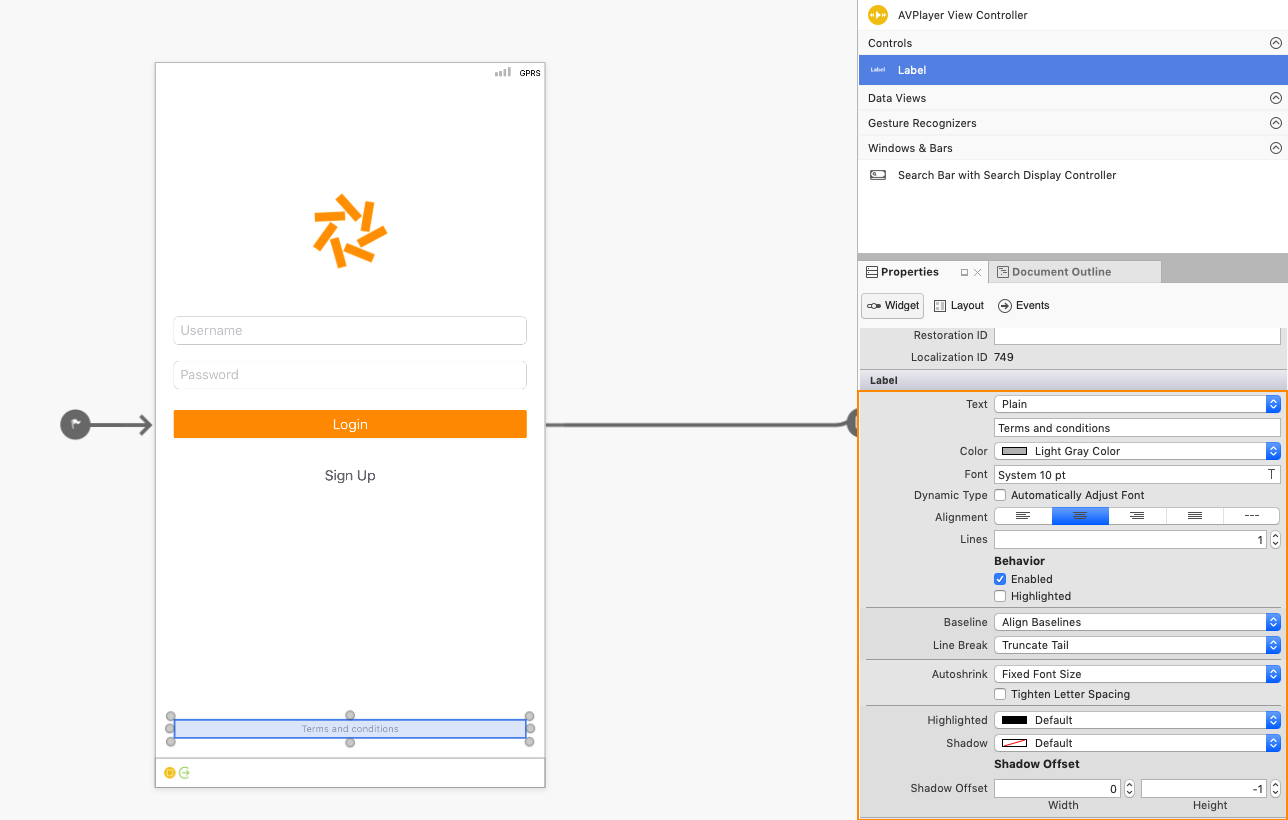
The following properties can be changed from the properties window:
- Text Context – Plain or Attributed. Plain text allows you to set the formatting attributes on the entire string. Attributed texts allows you to set formatting to different characters or words in the string.
- Color, Font, Alignment – Formatting Attributes that can be applied to the label.
- Lines – Sets the number of lines that the label can span. Set this to 0 to allow the label to use as many lines as needed.
- Behavior – Can be set to either Enabled or Highlighted. Enabled is set by default, disabled text will be displayed in a lighter grey color. Highlighted is disabled by default and allows the label to be redrawn with a highlighted state when it is selected by a user.
- Baselane and Line Break –
- Basline determines how the text will be positioned if the font sizes is different from the one specified.
- Line Breaks determine how a string will be wrapped or truncated if it is longer than a single line.
- Autoshrink – Determines how the font sized will be minimized within a label, if necessary.
- Highlighted, Shadow, Offset – Allows you to set the Hightlighted and Shadow color, and the shadow offset.