Button
There are three standard types of buttons:
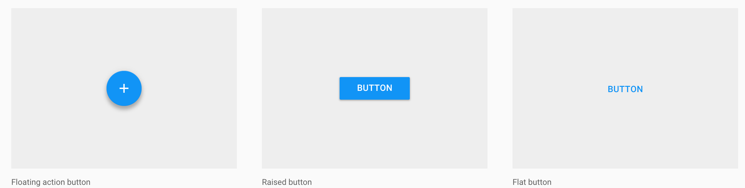
Floating action button: A circular material button that lifts and displays an ink reaction on press.Raised button: A typically rectangular material button that lifts and displays ink reactions on press.Flat button: A button made of ink that displays ink reactions on press but does not lift.
To create a button with text, use the following XML :
<Button
    android:layout_width="wrap_content"
    android:layout_height="wrap_content"
    android:text="LOGIN" />
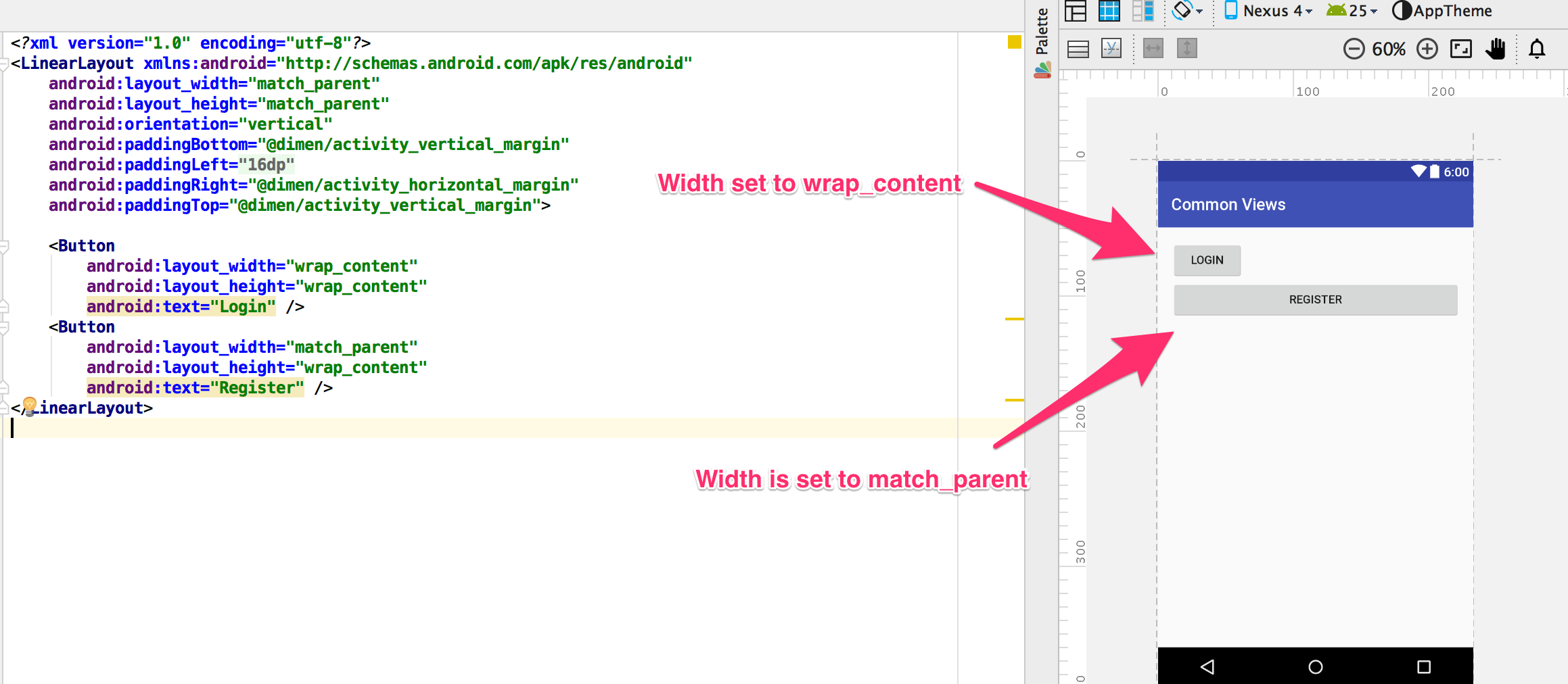
If we want the button's width to be the same as its parent, we would change the android:layout_height to match_parent.
<Button
    android:layout_width="match_parent"
    android:layout_height="wrap_content"
    android:text="LOGIN" />
In Android Studio, we can preview the effect of the wrap_content property on the width of the button.
Drawables on buttons
A normal button can also have an image on the left or right, by using the android:drawableLeft and android:drawableRight attributes. Thses drawables have
limited use as the images inside them can not be resized.
<Button
    android:layout_width="wrap_content"
    android:layout_height="wrap_content"
    android:text="@string/button_text"
    android:drawableLeft="@drawable/button_icon"/>
Floating Action Button
The floating action action button is available as a support package. You need to the Android Support Design v7 package from from Nuget before you can use it in the project.
<android.support.design.widget.FloatingActionButton
    android:id="@+id/fab"
    android:layout_width="wrap_content"
    android:layout_height="wrap_content"
    android:layout_gravity="bottom|end"
    android:layout_margin="16dp"
    app:srcCompat="@android:drawable/ic_input_add" />
The floating action button is mostly used inside the CoordinatorLayout or FrameLayout. This layout is also included as part of the Android Support Design Package.
<?xml version="1.0" encoding="utf-8"?>
<android.support.design.widget.CoordinatorLayout xmlns:android="http://schemas.android.com/apk/res/android"
    xmlns:app="http://schemas.android.com/apk/res-auto"
    android:layout_width="match_parent"
    android:layout_height="match_parent"
    android:fitsSystemWindows="true">


    <android.support.design.widget.FloatingActionButton
        android:id="@+id/fab"
        android:layout_width="wrap_content"
        android:layout_height="wrap_content"
        android:layout_gravity="bottom|end"
        android:layout_margin="@dimen/fab_margin"
        app:srcCompat="@android:drawable/ic_input_add" />

</android.support.design.widget.CoordinatorLayout>
FAB Properties
| Property | Description |
|---|---|
| Position | You can position the floating button by using layout_gravity attribute. |
| Size | FAB supports two sizes normal and mini. You can define the size of the button by using app:fabSize attribute |
| Background Color | By default, fab takes colorAccent as background color. If you want to change the background of fab, use app:backgroundTint attribute to define your own background color |
| Ripple Color | Sets the color of the ripple effect of your FloatingActionButton. Can be a color resource or hex string. app:rippleColor |
| Compat Padding | Enable compat padding. Maybe a boolean value, such as true or false. app:useCompatPadding |
| Elevation | Can be a string, integer, boolean, color value, floating point, dimension value. app:elevation |
Responding to Click Events
When the user clicks a button, the Button object receives an on-click event.
To define the click event handler for a button, add the android:onClick attribute to the <Button> element in your XML layout. The value for this attribute must be the name of the method you want to call in response to a click event. The Activity hosting the layout must then implement the corresponding method.
For example, here's a layout with a button using android:onClick:
<?xml version="1.0" encoding="utf-8"?>
<Button xmlns:android="http://schemas.android.com/apk/res/android"
    android:id="@+id/button_send"
    android:layout_width="wrap_content"
    android:layout_height="wrap_content"
    android:text="@string/button_send"
    android:onClick="sendMessage" />
Within the Activity that hosts this layout, the following method handles the click event:
/** Called when the user touches the button */
public void sendMessage(View view) {
    // Do something in response to button click
}
The method you declare in the android:onClick attribute must have a signature exactly as shown above. Specifically, the method must:
- Be public
- Return void
- Define a View as its only parameter (this will be the View that was clicked)
Using an OnClickListener
You can also declare the click event handler programmatically rather than in an XML layout. This might be necessary if you instantiate the Button at runtime or you need to declare the click behavior in a Fragment subclass.
To declare the event handler programmatically, create an View.OnClickListener object and assign it to the button by calling setOnClickListener(View.OnClickListener). For example:
Button button = (Button) findViewById(R.id.button_send);
button.setOnClickListener(new View.OnClickListener() {
    public void onClick(View v) {
        // Do something in response to button click
    }
});
Styling Your Button
The appearance of your button (background image and font) may vary from one device to another, because devices by different manufacturers often have different default styles for input controls.
You can control exactly how your controls are styled using a theme that you apply to your entire application. For instance, to ensure that all devices running Android 4.0 and higher use the Holo theme in your app, declare android:theme="@android:style/Theme.Holo" in your manifest's <application> element.
To customize individual buttons with a different background, specify the android:background attribute with a drawable or color resource. Alternatively, you can apply a style for the button, which works in a manner similar to HTML styles to define multiple style properties such as the background, font, size, and others.
Borderless Button
A style is used to get the a borderless button. Note that the style does not use the android prefix.
<Button
    style="@style/Widget.AppCompat.Button.Borderless"
    android:text="Borderless Button"
    android:layout_width="match_parent"
    android:layout_height="wrap_content" />
You can also get a coloured borderless button. The default color used is the accent color from the theme.
<Button
    style="@style/Widget.AppCompat.Button.Borderless.Colored"
    android:text="Borderless Button"
    android:layout_width="match_parent"
    android:layout_height="wrap_content" />
Custom background
If you want to truly redefine the appearance of your button, you can specify a custom background. Instead of supplying a simple bitmap or color, however, your background should be a state list resource that changes appearance depending on the button's current state.
You can define the state list in an XML file that defines three different images or colors to use for the different button states.
To create a state list drawable for your button background:
Create three bitmaps for the button background that represent the default, pressed, and focused button states.
To ensure that your images fit buttons of various sizes, create the bitmaps as Nine-patch bitmaps.
Place the bitmaps into the res/drawable/ directory of your project. Be sure each bitmap is named properly to reflect the button state that they each represent, such as button_default.9.png, button_pressed.9.png, and button_focused.9.png.
Create a new XML file in the res/drawable/ directory (name it something like button_custom.xml). Insert the following XML:
<?xml version="1.0" encoding="utf-8"?>
<selector xmlns:android="http://schemas.android.com/apk/res/android">
    <item android:drawable="@drawable/button_pressed"
          android:state_pressed="true" />
    <item android:drawable="@drawable/button_focused"
          android:state_focused="true" />
    <item android:drawable="@drawable/button_default" />
</selector>
This defines a single drawable resource, which will change its image based on the current state of the button.
- The first
<item>defines the bitmap to use when the button is pressed (activated). - The second
<item>defines the bitmap to use when the button is focused (when the button is highlighted using the trackball or directional pad). - The third
<item>defines the bitmap to use when the button is in the default state (it's neither pressed nor focused).
Note: The order of the
<item>elements is important. When this drawable is referenced, the<item>elements are traversed in-order to determine which one is appropriate for the current button state. Because the default bitmap is last, it is only applied when the conditionsandroid:state_pressedandandroid:state_focusedhave both evaluated as false.
This XML file now represents a single drawable resource and when referenced by a Button for its background, the image displayed will change based on these three states. Then simply apply the drawable XML file as the button background:
<Button
    android:id="@+id/button_send"
    android:layout_width="wrap_content"
    android:layout_height="wrap_content"
    android:text="@string/button_send"
    android:onClick="sendMessage"
    android:background="@drawable/button_custom"  />