Button
The Button view reacts to click events.
Define in XAML
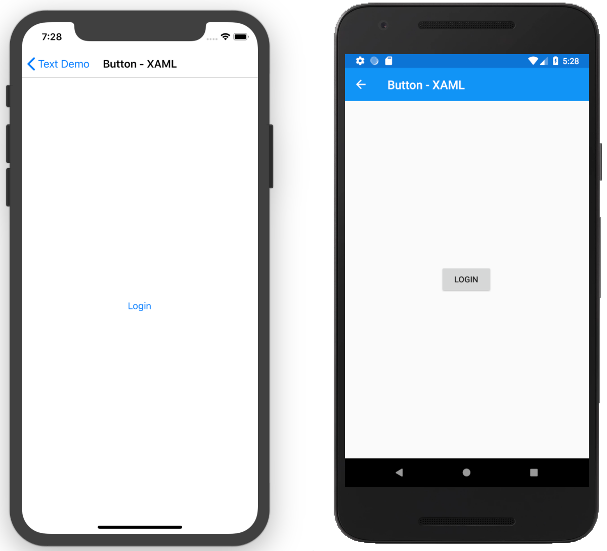
<Button Text="Login" />
Define in Code
var button = new Button
{
    Text = "Login"
};
Add a Click Event
We can attach a Click event to the Button in XAML and define a function in the backing code file with the function to handle the Button click event as follows :
In XAML
<Button Text="Login" Clicked="OnLoginButtonClicked" />
In Backing Code File
void OnLoginButtonClicked(object sender, System.EventArgs e)
{
    //Do something
}
Define the Click Event in Code
We can define the Button in XAML and attach the Click event in code. The Button will need to be named in XAML. We can give names to controls in XAML using the extension x:Name as following :
<Button Text="Login" x:Name="btnLogin" />
Note
The x:Name is a namespace defined on the XAML content page as follows xmlns:x="http://schemas.microsoft.com/winfx/2009/xaml"
A variable with the name btnLogin will be automatically generated and be available in the code file for the content page.
Wire Event in Code
After defining the name, we can now access the variable and attach the Clicked event as follows :
btnLogin.Clicked += (sender, e) => {
    //Do something
};
Styled Button
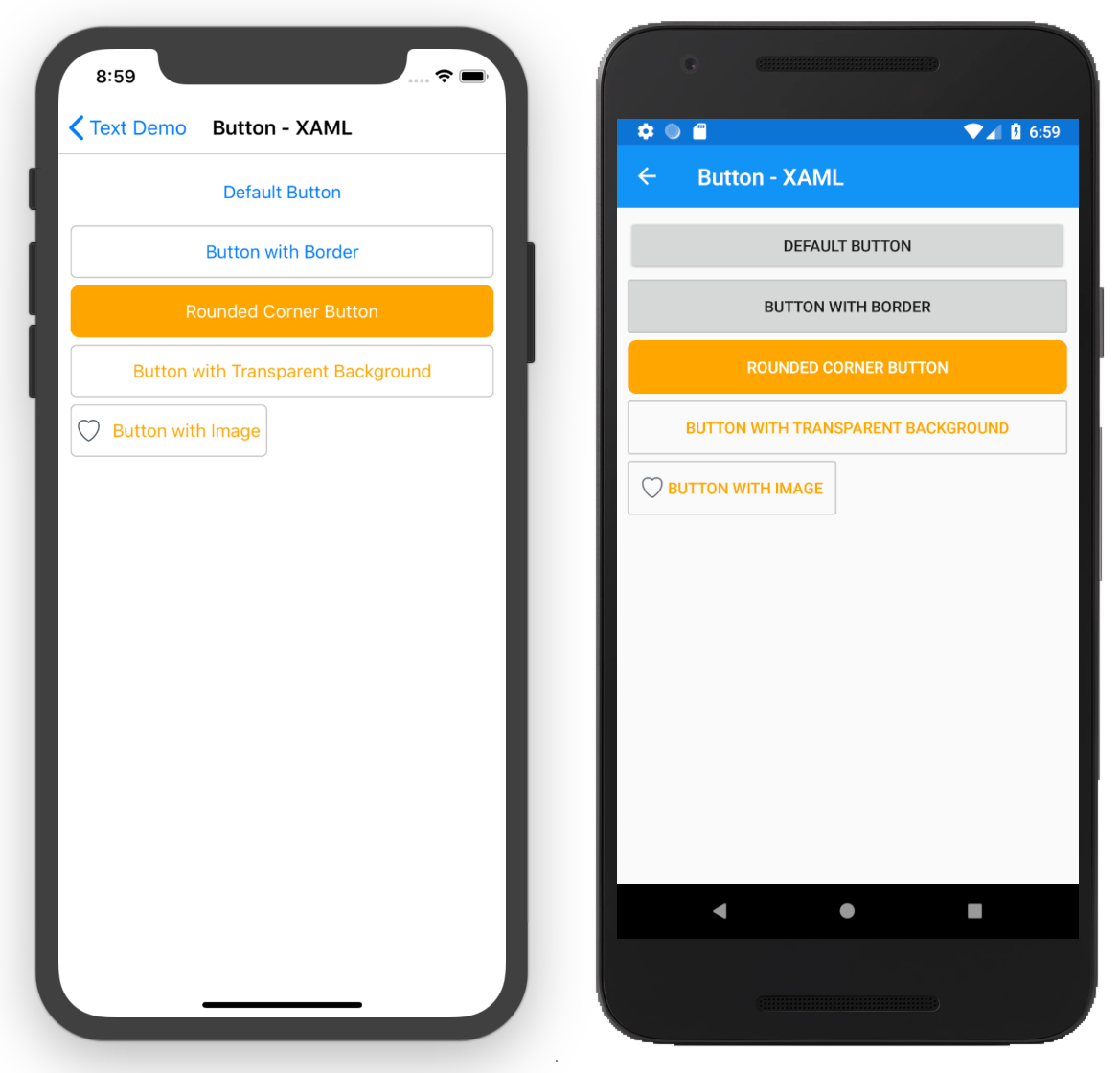 On iOS, the default button does not have a border. We can add border, change the border color, border corners and background color using the
 BorderWidth, BorderColor, BorderRadius and BackgroundColor.
<StackLayout Padding="10">
    <Button Text="Default Button" />
    <Button Text="Button with Border" BorderWidth="1" BorderColor="Silver" />
    <Button
        Text="Rounded Corner Button"
        BorderWidth="1"
        BorderColor="Orange"
        BackgroundColor="Orange"
        BorderRadius="8"
        TextColor="White" />
    <Button
        Text="Button with Transparent Background"
        BorderWidth="1"
        BorderColor="Silver"
        TextColor="Orange"
        BackgroundColor="Transparent" />
    <Button
        BackgroundColor="Transparent"
        Text="Button with Image"
        TextColor="Orange"
        HorizontalOptions="Start"
        Image="favorite"
        BorderColor="Silver"
        BorderWidth="1" />
</StackLayout>
Note
Remember if you are using images, you will need to add them to each project, Android and iOS. For Android, you need to add the images under Resources\drawable-* and for iOS you will need to add an Asset catalog and then add an Image Set. For iOS it's recommended to use vector formats so that you do not have to specify multiple images. 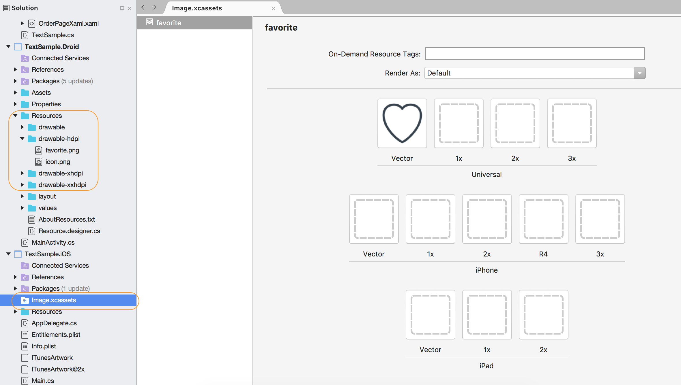
Circle Button
You will need to use a renderer in order to achieve this. The simplest way is to use a plugin. Here is a plugin that can achieve circle buttons, Circle Button Plugin
Commanding with Button
Note
Commanding is an advanced topic, we will explore this in much detail under the MVVM section. For now, we will go through the high level details on how to add a command to a button.
In using the MVVM(Model View-ViewModel) design pattern, there's a separation of the UI and business logic. If we had a button and we had some logic we wanted to run in the model, we can use the commanding interface to run our logic.
Define the Command
We first need to define the command property. It should be of type ICommand. This is an interface that have a few methods.
public ICommand DisplayAlertCommand { get; private set; }
Initialize the command in the constructor
Next we need to initialize the command in the constructor of the model :
public DemoViewModel(Page page)
{
    this._page = page;
    DisplayAlertCommand = new Command(ShowAlert);
}
and define the function that is called by the command, in our case we will show an alert using the Page DisplayAlert method as follows :
private async void ShowAlert(object obj)
{
    await _page.DisplayAlert("Alert", "Howdy from Command Button", "OK");
}
Initialize the model in the content page class
Once we have everything setup in the model, we can now create a new instance of the model and set it up as the BindingContext for our UI as follows :
BindingContext = new DemoViewModel(this);
Add the Binding to the button
Now we can bind the button to the command in our model in XAML as follows :
<Button Text="Bound to Command" Command="{Binding DisplayAlertCommand}" />
Putting everything together
Model\DemoModel.cs
public class DemoViewModel
{
    public ICommand DisplayAlertCommand { get; private set; }
    Page _page;

    public DemoViewModel(Page page)
    {
        _page = page;
        DisplayAlertCommand = new Command(ShowAlert);
    }

    private async void ShowAlert(object obj)
    {
        await _page.DisplayAlert("Alert", "Howdy from Command Button", "OK");
    }
}
ButtonCommandPage.cs
public partial class ButtonCommandPage : ContentPage
{
    public ButtonCommandPage()
    {
        InitializeComponent();
        BindingContext = new DemoViewModel(this);
    }
}
ButtonCommandPage.xaml
<?xml version="1.0" encoding="UTF-8"?>
<ContentPage xmlns="http://xamarin.com/schemas/2014/forms"
             xmlns:x="http://schemas.microsoft.com/winfx/2009/xaml"
             x:Class="TextSample.Views.ButtonCommandPage">
    <ContentPage.Content>
        <Button Text="Bound to Command"
                Command="{Binding DisplayAlertCommand}" />
    </ContentPage.Content>
</ContentPage>